Back to Playground
Back to Playground
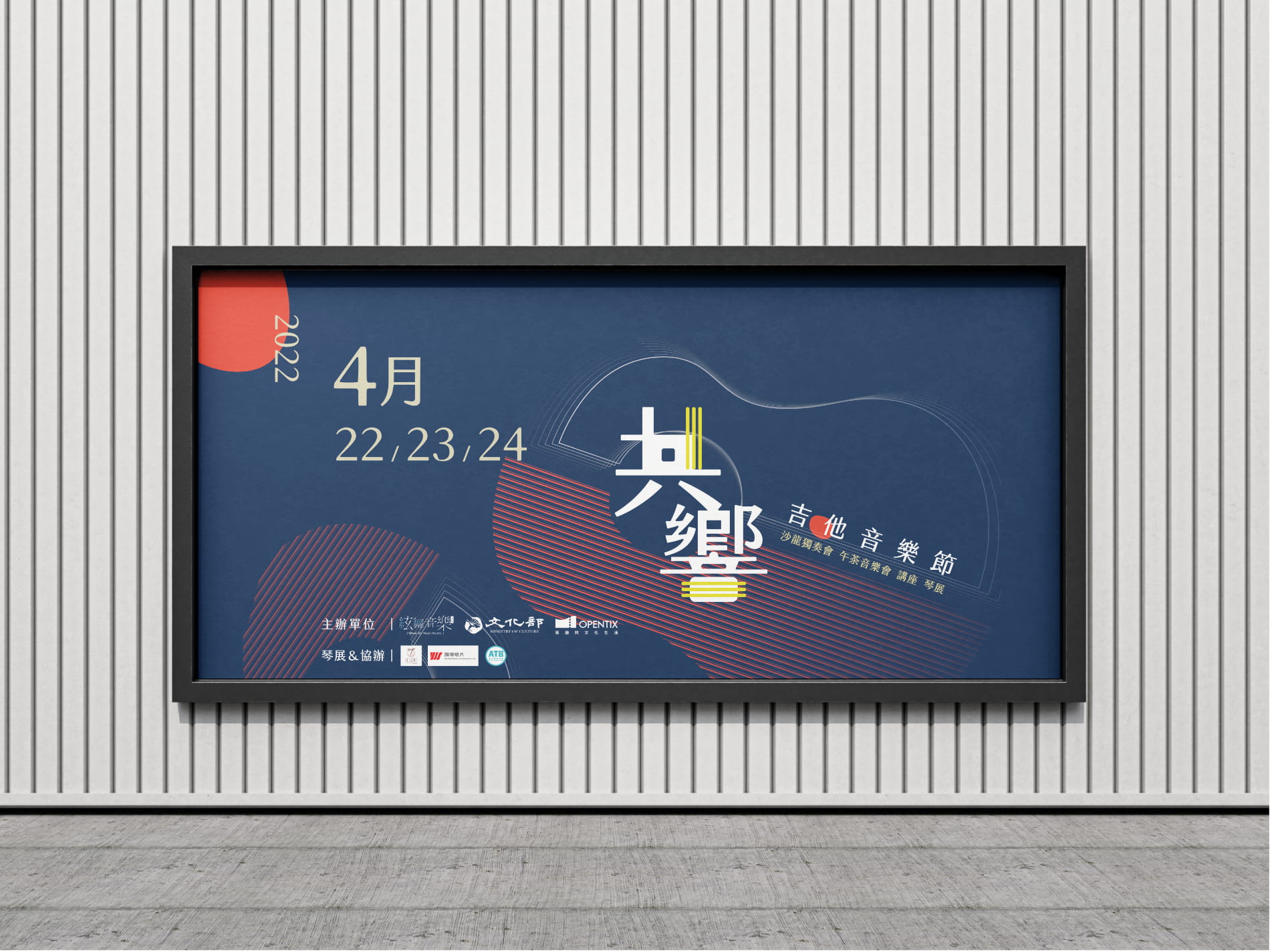
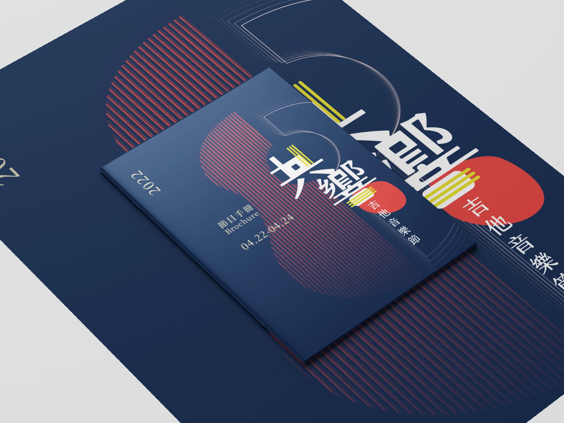
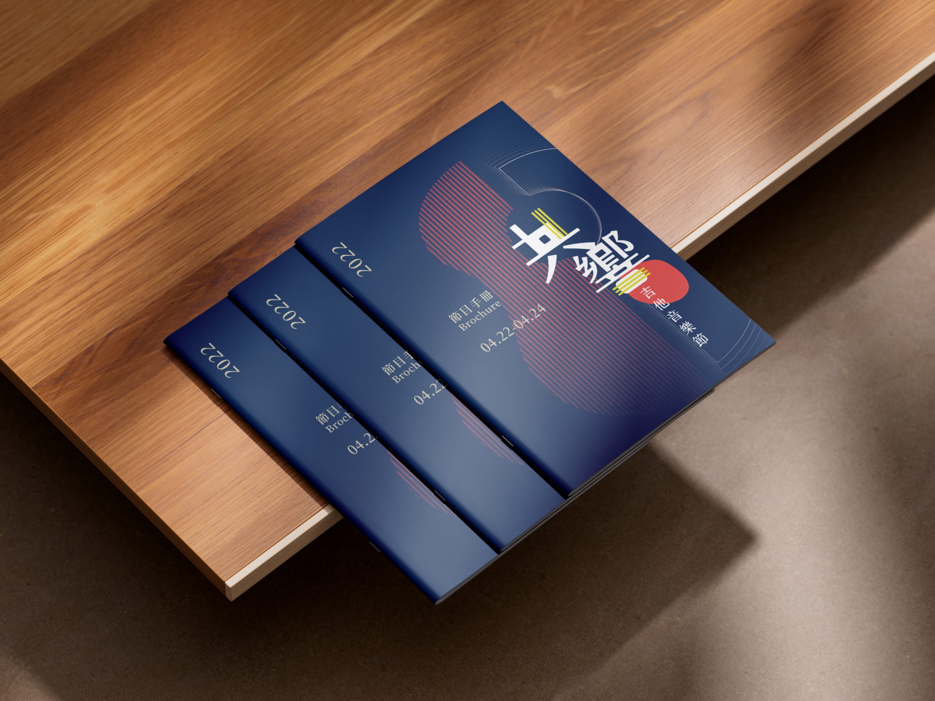
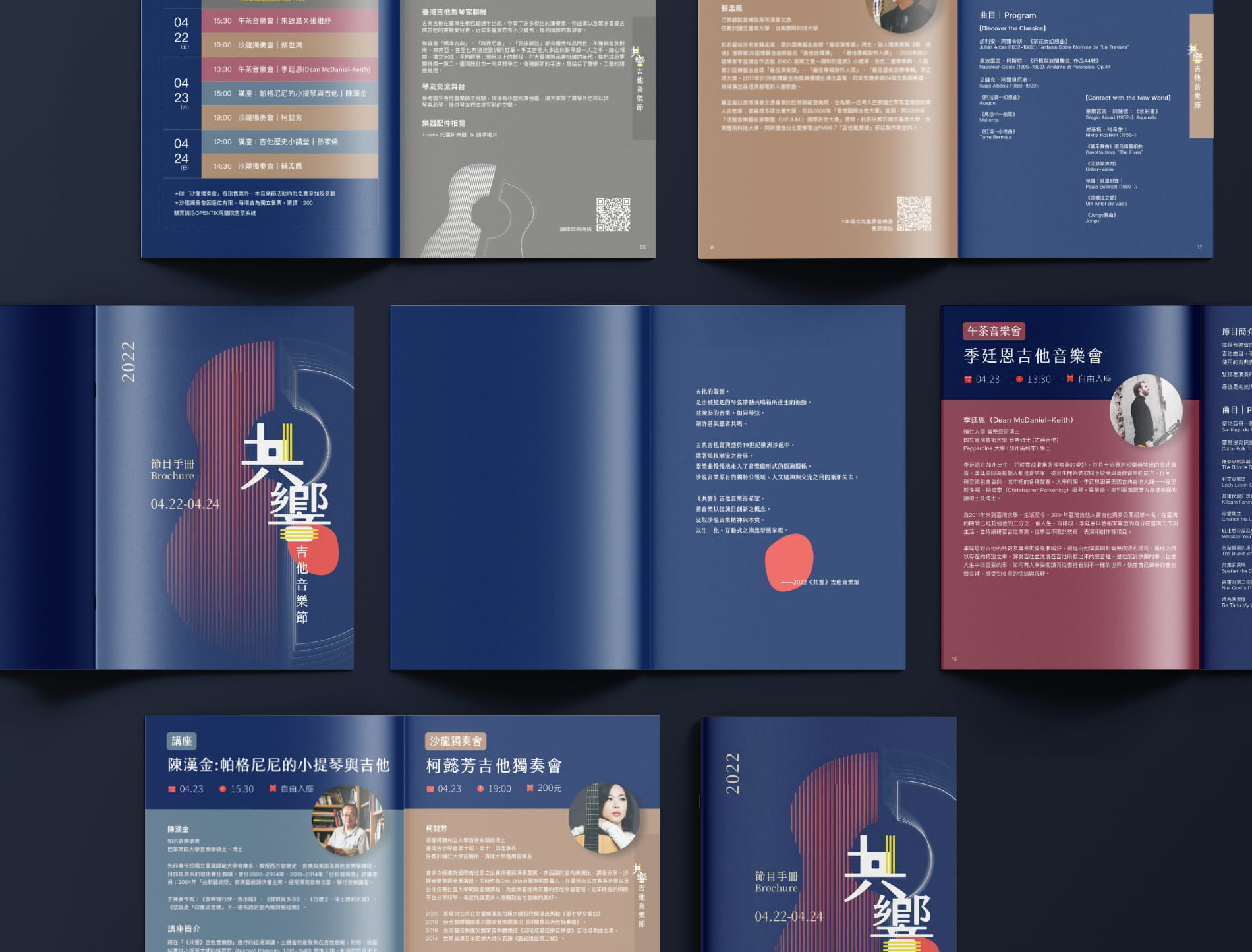
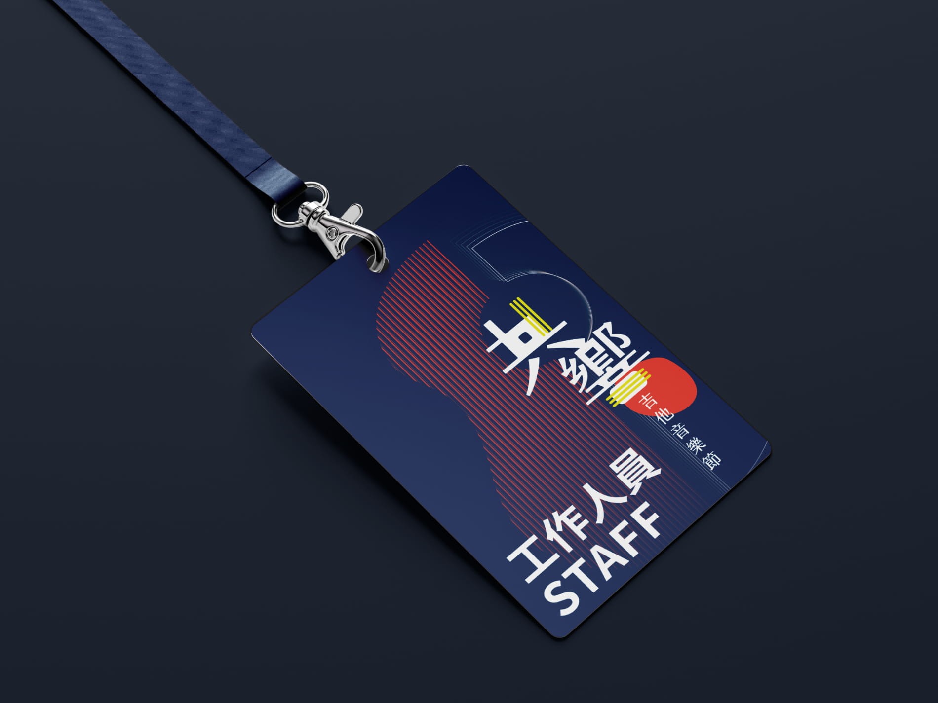
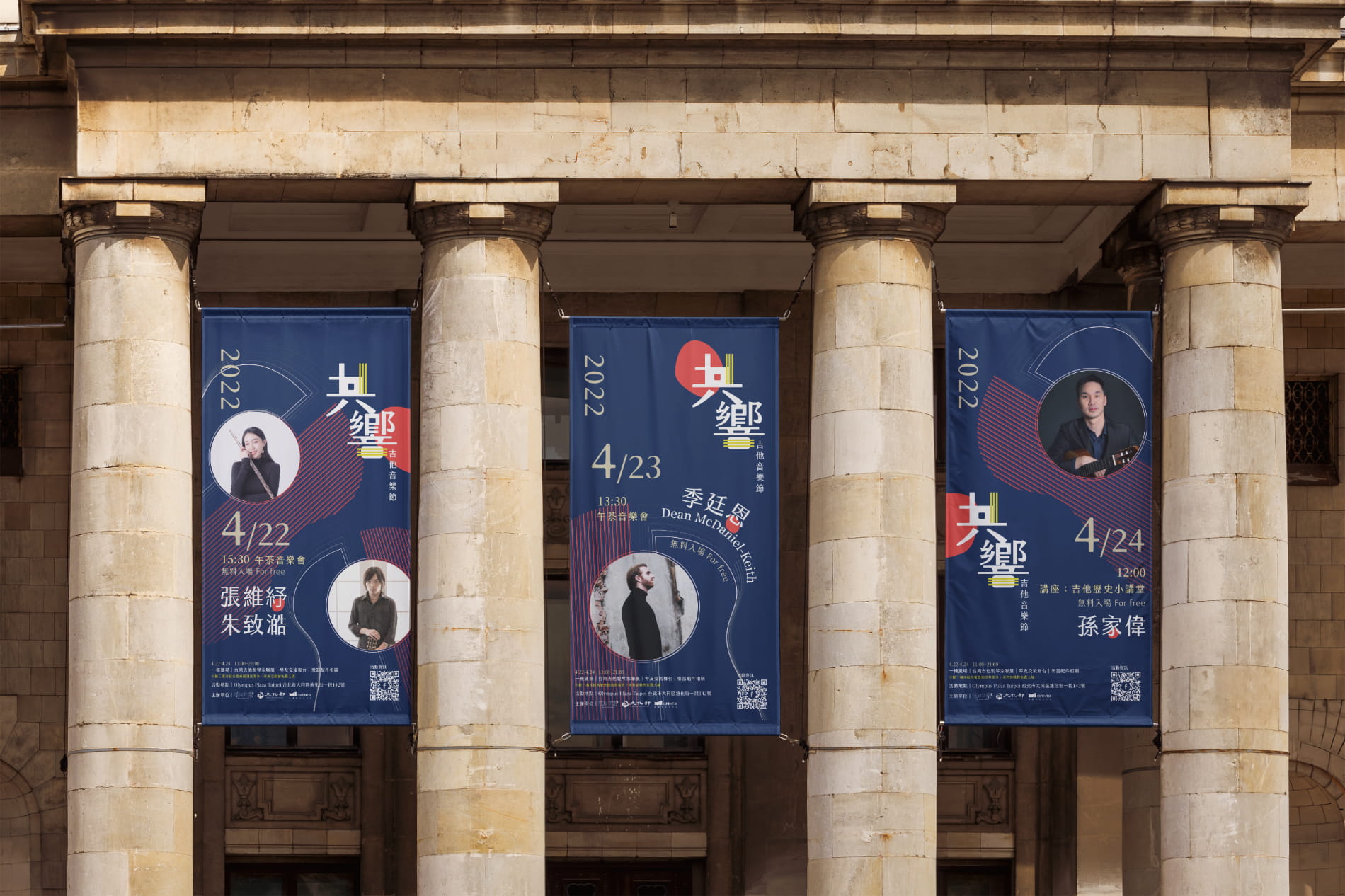
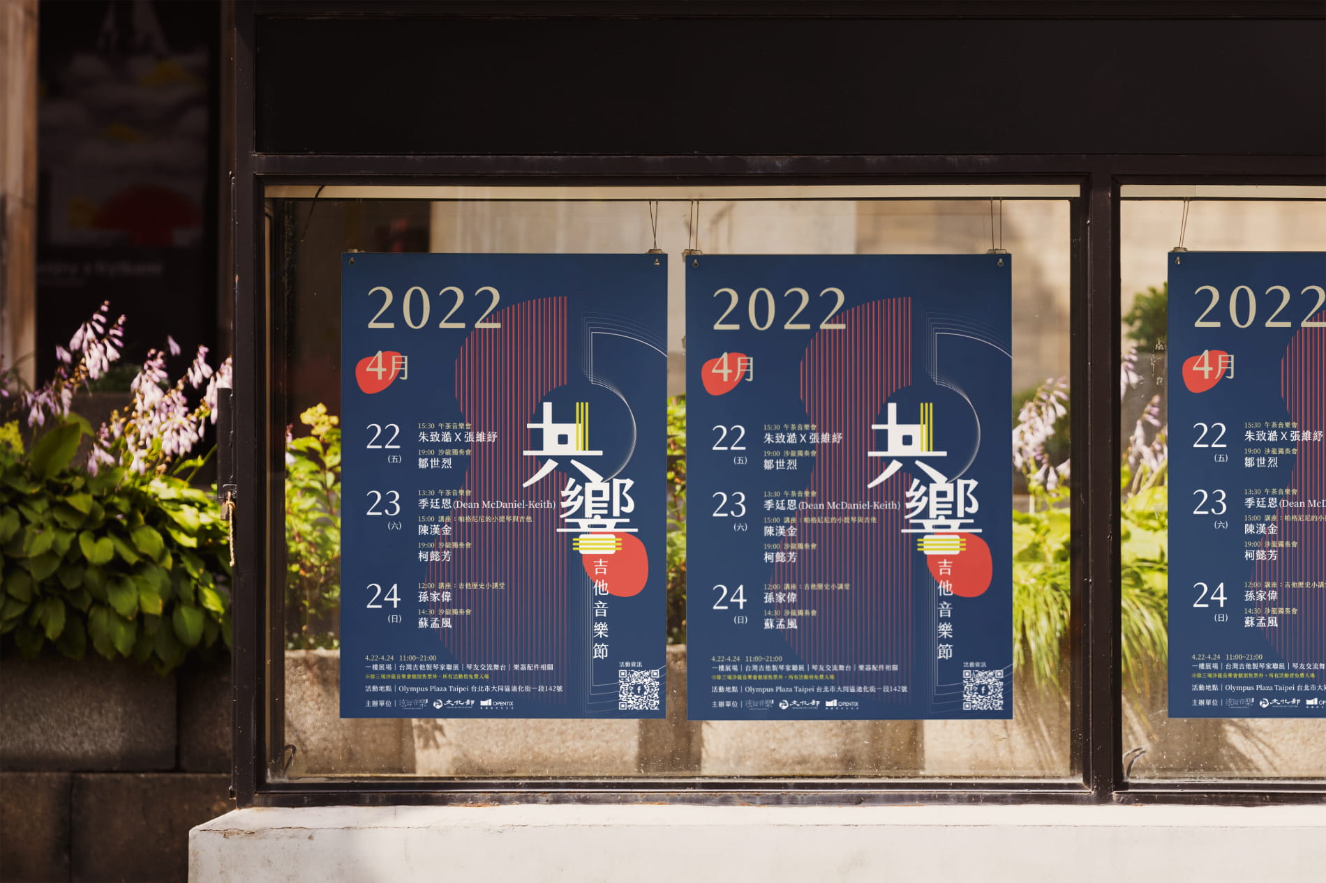
Resonant Strings Guitar Festival
Resonant Strings “共響” is a visual identity project for a guitar festival inspired by historical French salons. Originally exclusive gatherings for the elite, these salons are reimagined here as inclusive cultural spaces defined by warmth and intimacy. The name itself is a play on the Chinese word for resonance (gòng míng), but replaces the second character with xiǎng (響) to specifically evoke the physical ringing of guitar strings. By balancing classical elegance with modern accessibility, the branding mirrors this "shared resonance," inviting a contemporary audience to experience the collective joy of the music.
Visual Identity
Graphic Design